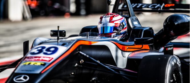
PROJECT
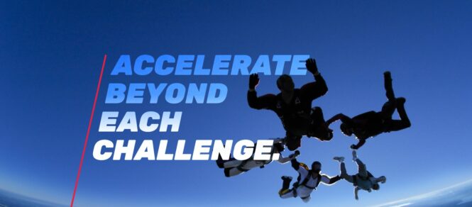
Flying high
CLIENT
British Skydiving
DELIVERY
- Branding
A brand leading the way within an exhilarating sport.
With member intake in decline and the sport evolving into more disciplines and techniques, BPA changed their name. Now British Skydiving, the governing body, required a bold brand to engage new generations and increase participation in the sport.
Collaborative client workshops and interviews allowed us to understand the sport. Speaking to different stakeholders, the governing body and skydivers (instructors, experienced skydivers, first-timers and their families) gave us valuable insight into what the sport means to them, how they perceive the governing body, how they need to communicate.
The typographic logo symbolises the speed and velocity of skydiving, swooping through the letterforms indicative of a skydiver’s technique. The brand expresses who they are now – a future-focused organisation that appeals to new and existing participants, positioning them alongside other world-class sporting bodies.
Setting trends since its hugely positive unveiling at the 2020 Skydiving Expo, associated governing bodies, including the Australian Parachute Federation and the US Parachute association, have begun to rebrand, shifting their names from Parachuting to Skydiving.


Sponge clearly demonstrated a high level of expertise and understanding of our organisation. They provided us with the confidence they can develop a brand personality that encourages participation and continued engagement within the sport.
Angel Fernandez
Communications Manager