Brand, print and signage for Orchard Homes
Focusing on outstanding quality and distinct developments.
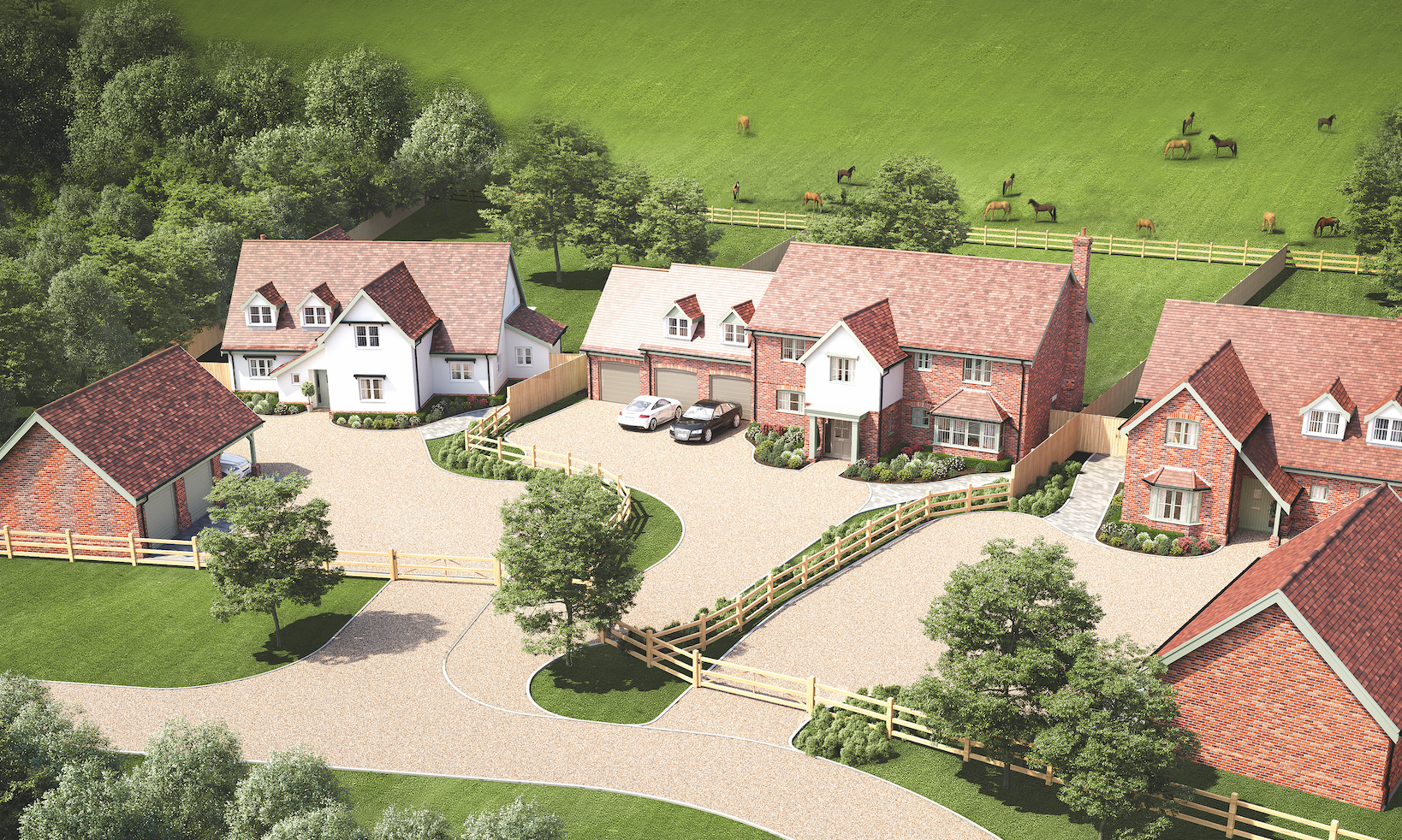
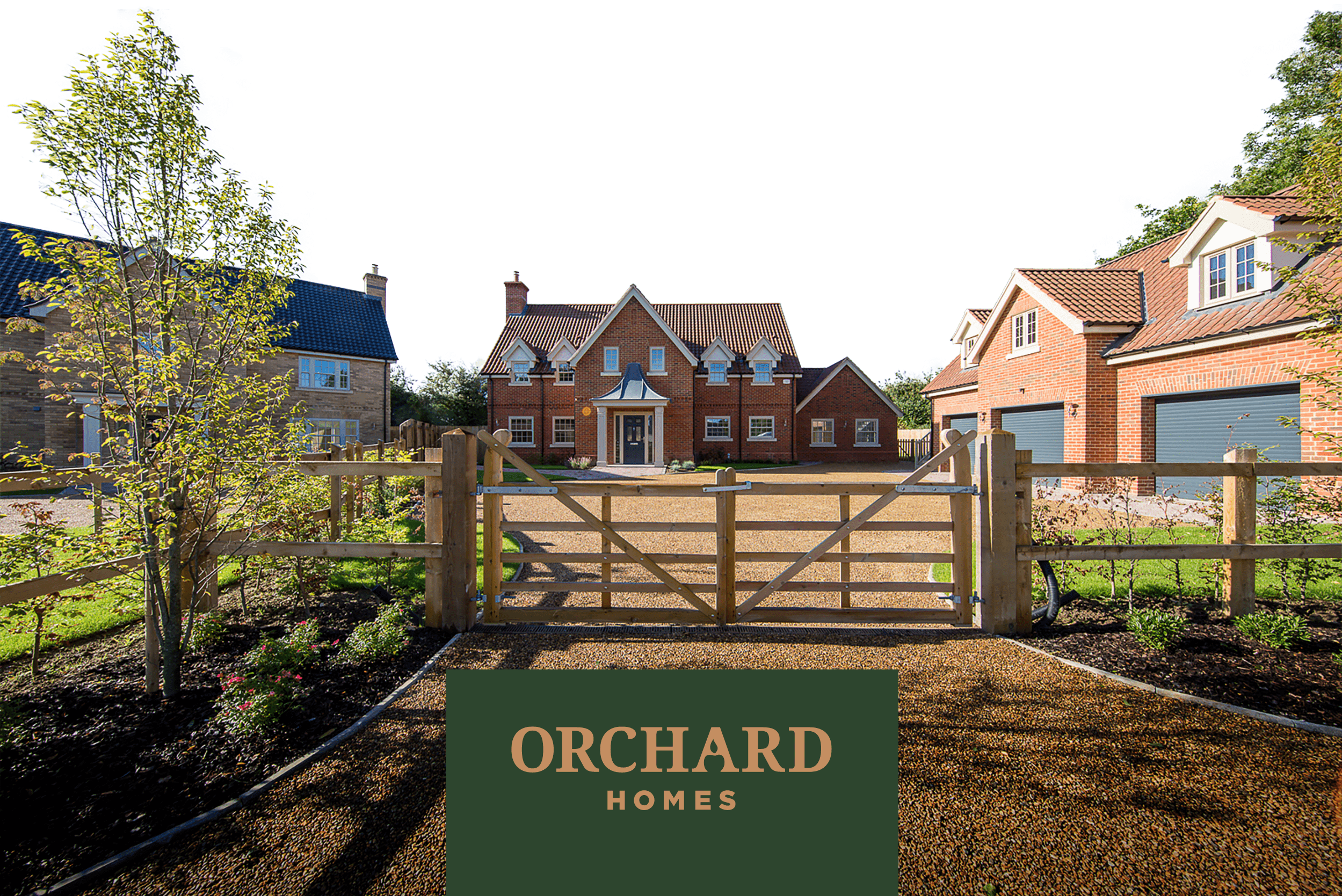
Challenge: Orchard Homes, a renowned developer in the heart of Norfolk, sought a new brand identity. The challenge was to accurately represent the exceptional quality and prestige of their exclusive collections of stunning countryside homes, which feature high-quality specifications and picturesque development plans.
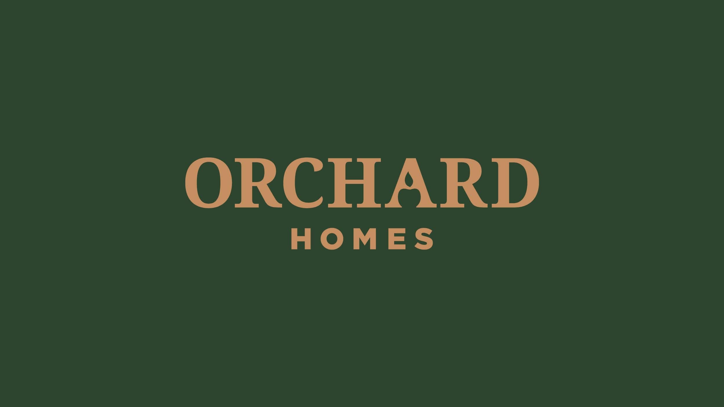
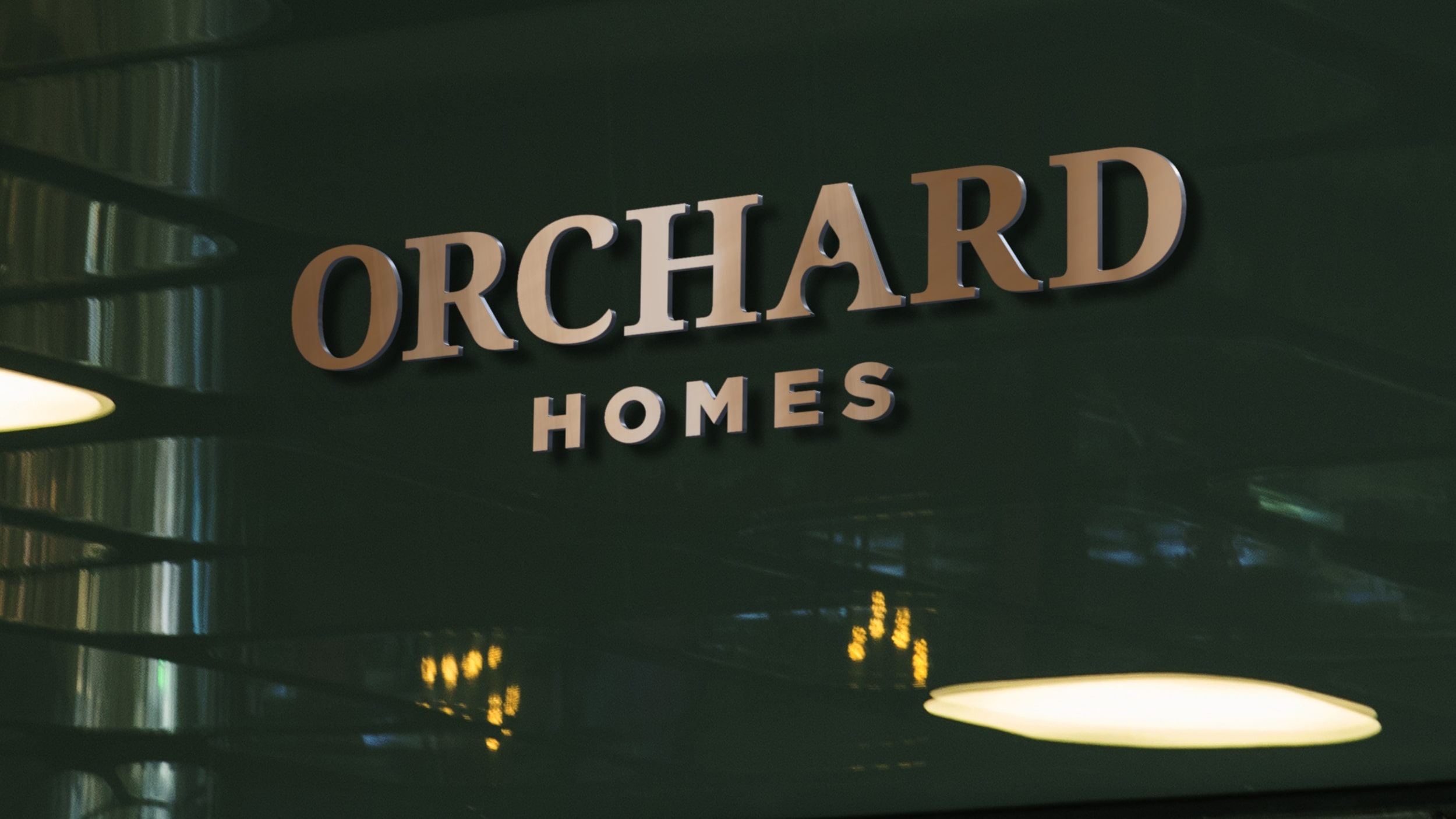
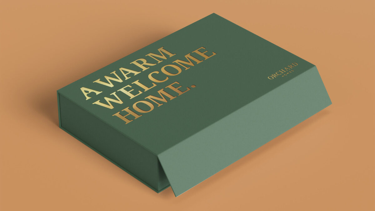
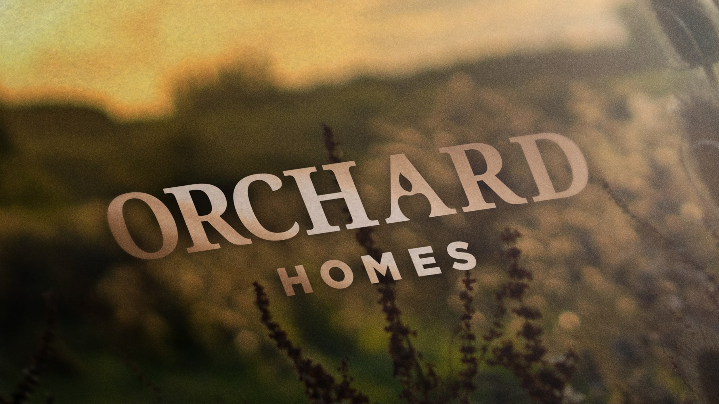
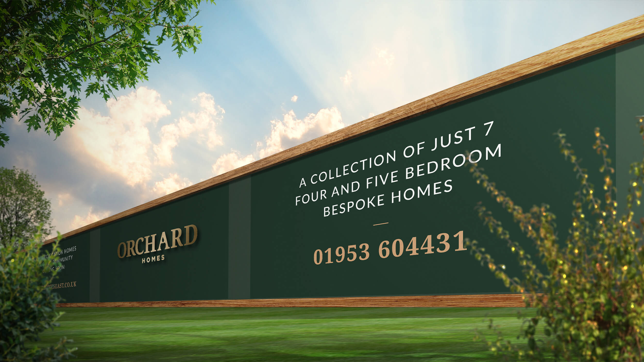
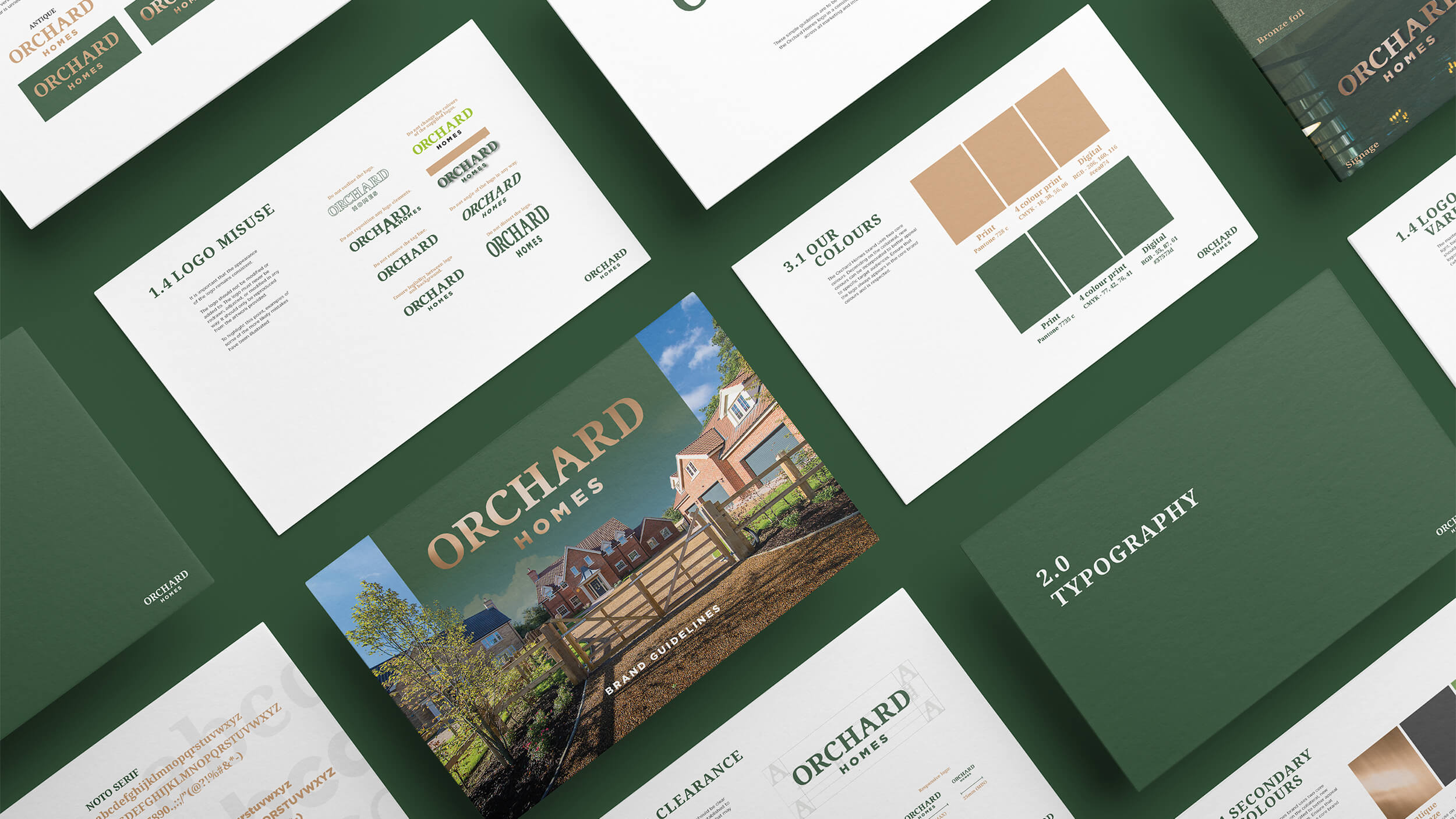
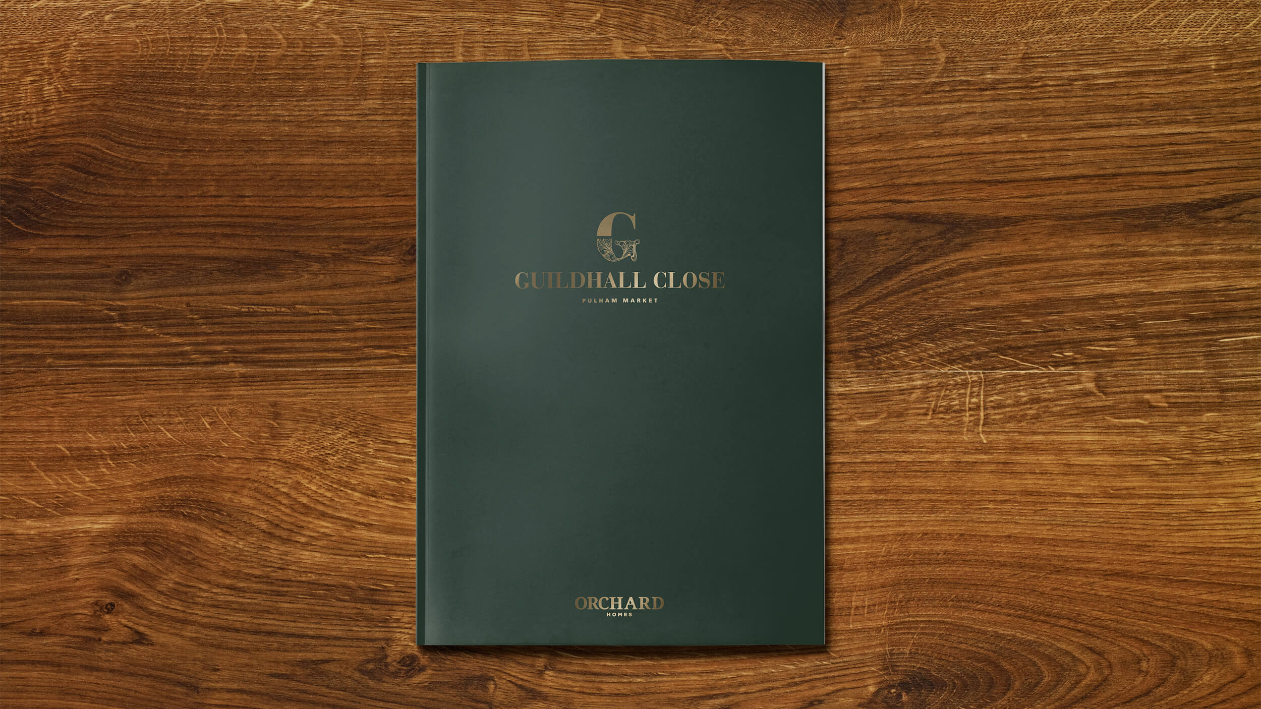
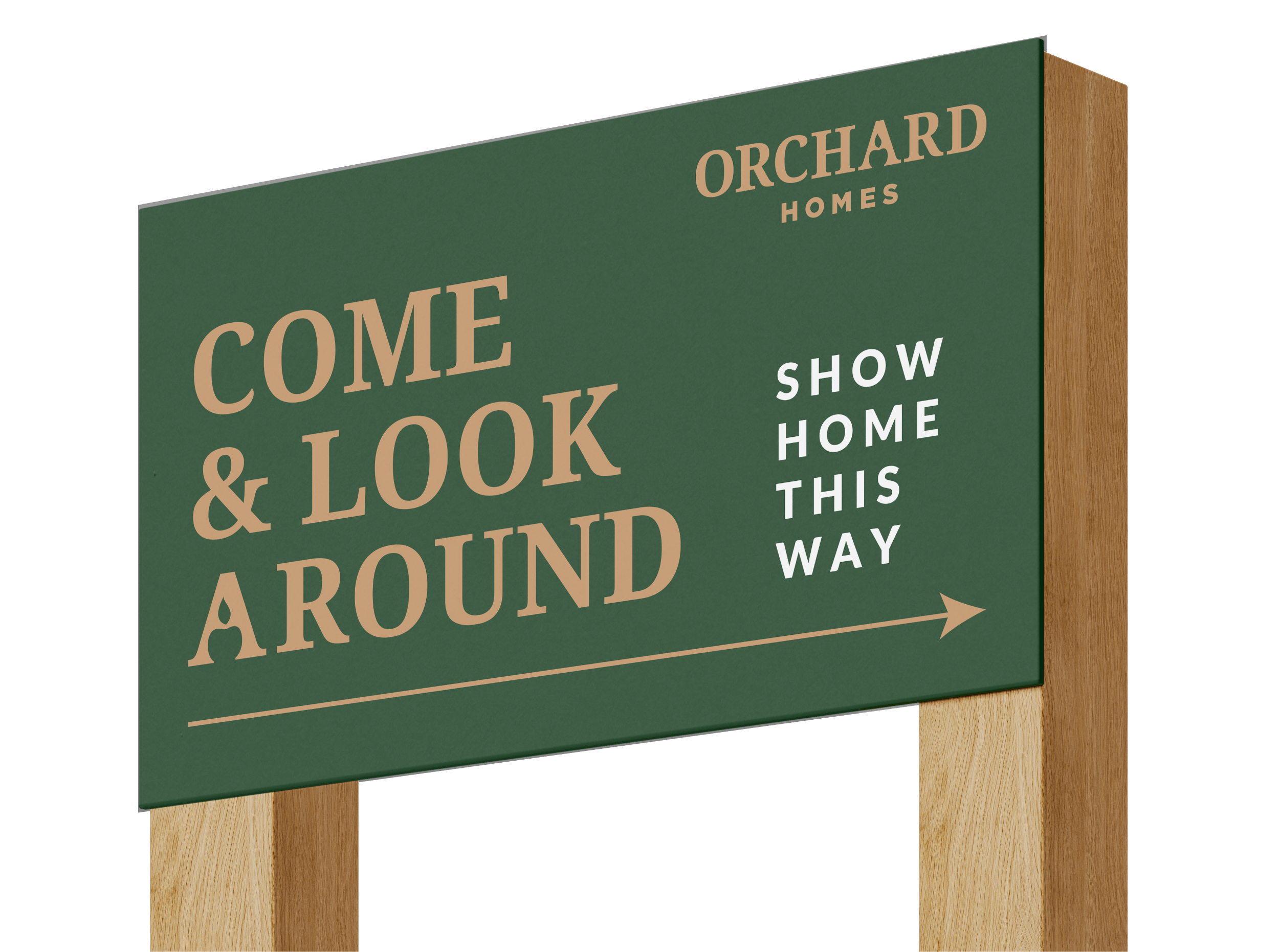
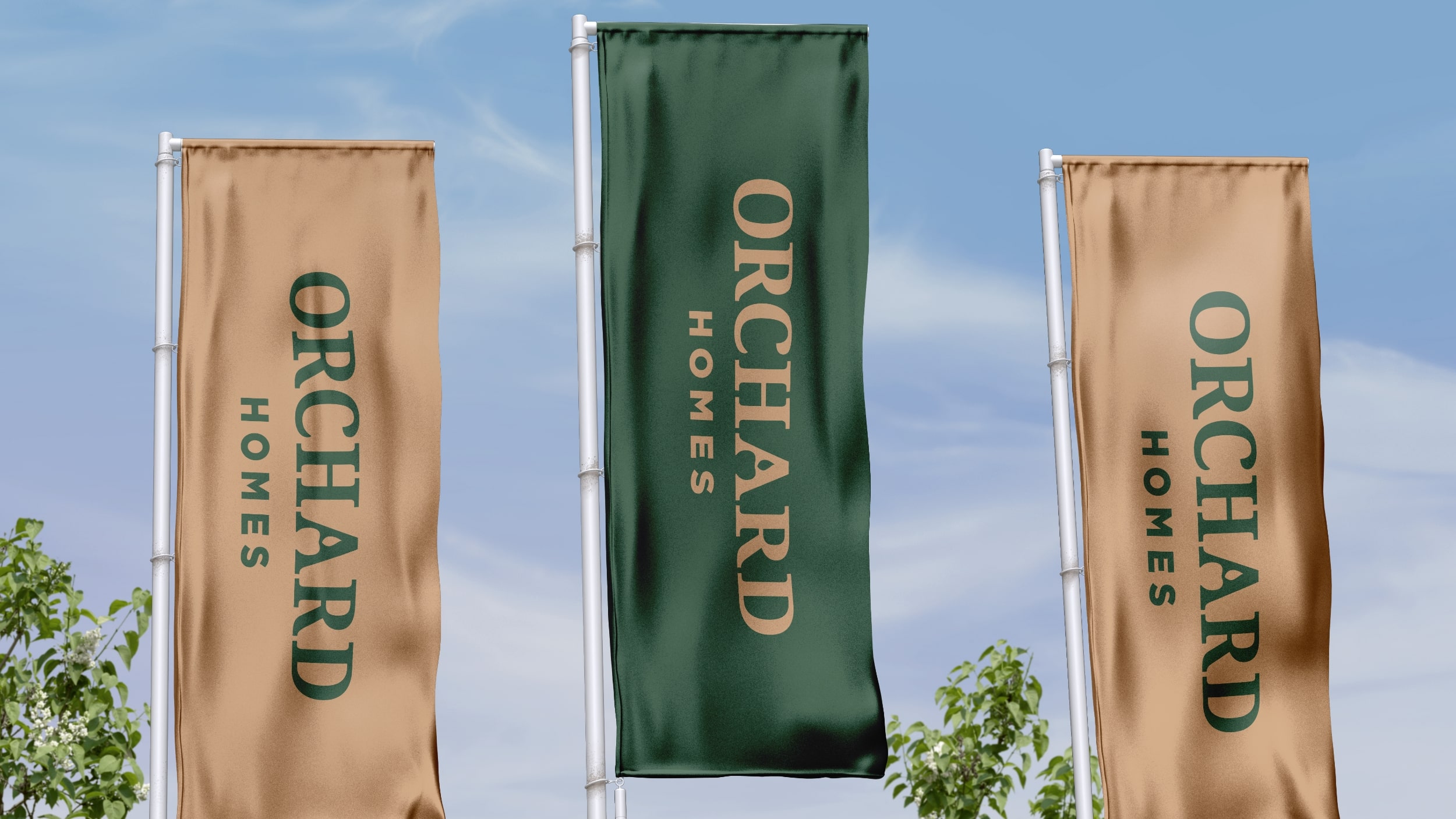
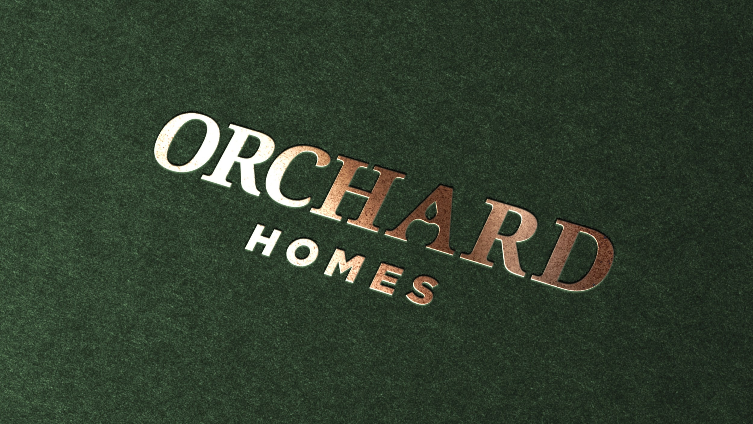
Solution: We crafted a sophisticated logotype that subtly integrates an ‘Orchard’ apple within the negative space of the ‘A’, reflecting their name and heritage. A traditional, refined colour palette was then employed across a complete set of new brand guidelines, which also provided guidance on a more exclusive tone of voice. New signage, van livery, and marketing assets were also developed to ensure consistent application of the refreshed brand.
Outcome: The new brand identity significantly improved Orchard Homes’ image and buyers’ perceptions of them as a prestigious regional developer. The cohesive and refined branding effectively communicates the outstanding quality and distinct nature of their developments, reinforcing their position in the luxury property market.


Every great result starts with a conversation.
READ
FIND US
Fuel Studios, Pottergate,
Norwich, NR2 1DX